Wednesday 21 October 2009

Tuesday 20 October 2009

tiger art of war


tiger art of war poster

rabbit art of war


rabbit art of war poster

dragon - art of war


dragon art of war poster

unicorn - art of war


unicorn art of war

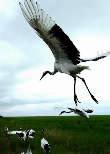
CRANE - art of war development


I feel like ive hit my stride a bit with this art of war project. I am trying to get across the old and the new and relating it to business and industry.

Thursday 15 October 2009

Wednesday 14 October 2009

RL -HIGRADE002 - projectiles


Many small labels only print on the vinyl itself and dont have a proper cover for the vinyl. This is something i may have to think about when designing and have a vinyl centre that works on its own terms. This design for higrade002 is basic but works well when the vinyl is playing as the "blade" spins around. Considering how the record is going to be used is something i need to consider in my design. The blade is also the record company logo and promotes the label clearly on the shelf.

RL - 5 years of hyperdub comp.


This is the album art for the 5 years of hyperdub album. It reflects the experimental nature of the music on the album and the record label. The glitchy art style looks simple at first glance but is reasonably intricate. It has a strange style of marking 5 on the cover, futuristic - hyperdub are experimental and always looking to the future. It also fits in well with the rest of the hyperdub art. I feel they could of done more with the tracklisting as it is basic, but readability is an issue especially for working DJs and this is something i need to think about when designing vinyl and CD cover art.

Module rationale sheet


Module rationale and statement of intent.

Klearkase shield ideas


Some of the initial ideas for the Klearkase logo brief. I went with the shield style insignia with some water droplets to better represent what the company does.

99 designs - KlearKase Brief

Another brief i am working on -

brief overview
This new startup has been created by a group of technology veterans who love the new mobile electronic devices available in the market; the Amazon Kindle & Sony Electronic Book Readers and iPhone to name a few. We build protective cases so that our customers can safely use their devices at the beach, swimming pool, on a picnic, or any other environment where they can get wet, dirty, and dropped

brand name KlearKase target audience
The general audience for our cases is very broad and the demographics vary depending on the electronic device category. Electronic book readers are a mature demographic with about 70% over 40 years of age. Smartphone owners are 65% more likely than the average mobile phone subscriber to be between the ages of 25 and 34.

requirements
We are looking for a black & while logo to represent our company called KlearKase.
Keywords: protective, waterproof, high quality, clarity
We're pretty sure that KlearKase should have the ‘K’ and the ‘K’ capitalized. But prove us wrong if you disagree.
The typeface should be clear, simple and bold. We want something that stands out. Again be careful not to be too fancy.
The logo should work on the plastic case, plastic packaging, the web, as well as letterhead and business cards.
Please make sure there is no intellectual property infringement.
We require a CMYK logo in PDF, EPS, SVG, or Adobe Illustrator AI format, as well as a JPG.
Be creative but try and keep the design 'clean'. The winning design needs to be black & white.

badman poker initial ideas


some initial ideas for the badman poker brief. I decided for the first tries i would go with the gangster theme suggested on the brief. This took a lot longer than i anticipated!

Record Label Photostream


http://www.flickr.com/photos/43555794@N06/

This is a photosteam of some of the source photos for the cyberspoon project. I cant get them all up on flickr until i sort a better host out.
I basically wanted to collect together a large number of photos of the artists involved as well as general sound equipment so i had a lot of source photos to work with as a jumping off point for the brief.

Tuesday 13 October 2009

badman poker logo brief

brief for badman poker logo

brief overview
badmanpoker.com is a web site providing poker related content to all levels of poker players. From home game heroes, to casino regulars, to online stars.

Poker champs are all about attitude and our website will delivery this in spades.

brand name badmanpoker.com target audience
Our target audience is anyone who loves poker as much as we do.

requirements
Our logo should be crisp, clean and instantly recognisable.

The logo must scale well, from small print to large.

The text “badmanpoker.com” doesn’t have to appear in one continuous line. Feel free to split the individual words up, to accommodate your creativity.

With the name “Bad Man”, thoughts immediately go to graphic elements that can include “old school gangsters” or “wise guys” (no cartoon characters) and other elements that portray aggression and attitude. Having said that, the graphic element cannot contain any firearms or weapons of any kind. The graphic element cannot portray any acts of violence.

The logo can contain poker cards, poker suits or poker chips but designers shouldn’t limit themselves to these elements only. If you’ve got an “out of the box” idea, run with it as we are open to your creative ideas.

Any graphic element should be able to stand alone, separate to the text.

Please don’t use any copyrighted elements such as stock images or clip art.

Files will be required in vector format (Adobe Illustrator).

** We are open to all sorts of ideas for this logo so if you have a great idea that doesn’t quite fit the information above, that’s cool, let’s see what you’ve got.

Monday 12 October 2009

99 designs - Brief


This is the written up brief for the overview of the 99designs.com brief i am taking on.

99 designs

99designs.com is a website that people post up what they want designing and then people can answer the brief and get paid for it.

They generally want logos and the like, this is something i want to focus on in this module so i am going to do several briefs from this page as quick briefs to expand my logo collection for my portfolio.

Wednesday 7 October 2009

Record Label Brief


Live brief for a record company.

Tuesday 6 October 2009

messy crane - art of war development


trying some new brush techiques, this could develop into a workable style, but needs a lot of refining still.

crane - art of war development


Mechanical crane, experimentation with the crane and modern day business. I need to give the piece an overall feeling of a mix between ancient and new, maybe with the flair of calligraphy/flowing inks.

metropolis flyer


The metropolis flyers are an inspiration. I like the combined effect of lots of random industrial style objects. I think i could combine a chinese effect with a collage of objects to create the old/new feeling i want to achieve for the art of war brief.

Strictness - Study

characterized by or acting in close conformity to requirements or principles: a strict observance of rituals.

Courage -study

http://en.wikipedia.org/wiki/Courage

Courage, also known as bravery, will, intrepidity, and fortitude, is the ability to confront fear, pain, risk/danger, uncertainty, or intimidation.

benevolence - study


http://en.wikipedia.org/wiki/Benevolence

Benevolence is the expression of kindness and altruism.

Chinese character ren2 -
It means 'benevolence' or 'humanity.' The left side is the ren2 radical (man) and the two (er4) on the right implies 'two persons' so the character stands for 'benevolence among people.' Ren2 is the heart of Confucianism. It is also a Chinese last name.
Pronunciation: ren2
Meaning: benevolence; humanity; virtue; kernel.

Sincerity - Study

http://en.wikipedia.org/wiki/Sincerity

"Sincerity is the virtue of one who speaks truly about his or her own feelings, thoughts, desires."

wisdom - study


http://en.wikipedia.org/wiki/Wisdom

"Wisdom is knowledge of what is true or right coupled with just judgment as to action; sagacity, discernment, or insight."

"Confucius stated that wisdom can be learned by three methods: Reflection (the noblest), imitation (the easiest) and experience (the bitterest). Wisdom is not told by self but unless asked for by another."

"In Taoism Practical Wisdom may be described as knowing what to say and when to say it."

http://www.squidoo.com/divine-birds

Cranes
The Crane is a symbol of long life and immortality
The Crane is associated with longevity, health, happiness, wisdom and good luck.

In Asia, Cranes are symbols of longevity and immortality. The White Crane can fly to the heavens and it is a Chinese symbol for "wisdom" and is sometimes called the "heavenly" or "blessed" Crane. Cranes were vehicles of the gods and in China fly them to the "Isle of the Immortals", the legendary home of the eight immortals. A Crane's eggs were used in magic potions to grant eternal life upon its drinkers.

Logo design - misipile


http://www.misipile.com/

A croatian logo design studio, i really like some of the logos in their portfolio. I find having a lot of fresh logos from other companies to look at can really inspire me. They lay out the logos in the portfolio in full colour/grayscale and one colour, and tell a little about the inspiration for each. They all look professional, I need to make sure that any logos i design work on various different media, as appropriate for whatever the logo is for.

Thursday 1 October 2009

Art of War - BRIEF


First draft of brief for the art of war.

Wednesday 30 September 2009

art of war - wisdom and the city


Another experiment on the art of war theme, im trying to incorporate modern elements to the design, thus i used a cityscapes negative to simulate ink on a page.

art of war - wisdom ying yang early design


Another concept design, this time incorporating the ying-yang symbol, something anyone wise would understand in the art of war.

Art of war - wisdom early design.


A poster based on wisdom, no real deep concept other than the use of cherry blossom and the chinese symbols, just seeing if i can capture a style and experimenting.

source image - cherry blossoms


cherry blossoms are a very east asian motif, and symbolise extreme beauty and quick death.

http://en.wikipedia.org/wiki/Cherry_blossom

DEF13 - designer


Some inspirational designs from the designer DEF13, i really like the modern take on the chinese dragon, something i want to play with in my designs.

Development - Poster design art of war


First trial run on getting a art of war/oriental feel to a poster, very rough, but i am enjoying working with a inky splatter. I may add more real images to the design. I am considering a modern businessman twist in with the traditional.

Deadliest Catch Case Study


http://abduzeedo.com/case-study-deadliest-catch

A case study for the development of the deadliest catch poster. I love how this piece captures the energy of the show and its interesting to see how it all came together. I am thinking of using something like this blending the real and ink like scatter into the art of war brief.

The Commander

In the art of war the commander stands for 5 things

wisdom, sincerity, benevolence, courage and strictness.

I could base my poster set around a poster for each of these values. The poster could work in a set.

Hokusai - Mt. Fuji Off Kanagawa (The Wave)


Hokusai (1760-1849) created "Mt. Fuji Off Kanagawa" (popularly known in the West as "The Wave") as part of his subscription series, "Thirty-Six Views of Mt. Fuji," completed between 1826 and 1833. This is one of the best-known Japanese woodblock prints, and with others of this period inspired the entire French Impressionist school. James Abbott McNeill Whistler (1834-1903, of "Whistler's Mother" fame) was strongly influenced by the strong lines and bright colors of Japanese prints.

http://art-in-japan.blogspot.com/2008/06/mount-fuji-ukiyo-e.html

modern chinese design - Leslie chen


A more modern design by leslie chen, i like the intricy of the pattern that works as a whole, the black line through it gives it a strong composition.

Japanese Tattoos


A proper japanese traditional tattoo can take upto 5 years of weekly visits to complete. The striking design is complex yet powerful. This style could be twisted for a modern take to be mixed up in the poster designs.

Wenda Gu


Wenda Gu

http://www.wendagu.com

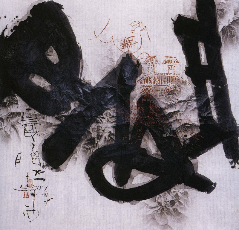
I really like this guys take on working with calligraphy, making something new for a modern world.

Modern Chinese Calligraphy


http://www.slideshare.net/kim_munson/modern-chinese-calligraphy

Above is a slideshow about some modern chinese calligraphy, something that has inspired me to do this project.
The images are works by Gu Gan, one of the first people to start using colour in calligraphy. I love the interplay of the black and the white shapes as well as the texturing thats modern compared to traditional techiques.

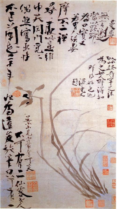
Ink and Wash Paintings


Ink and wash paintings come from an extension of calligraphy. Using ink and water on paper, they have a definite east asian feel to them, they reflect well the mystical nature of the culture.

http://en.wikipedia.org/wiki/Ink_and_wash_painting

East Asian Calligraphy


I love the paintbrush style of traditional chinese calligraphy, it has a whole art form to it that has been developed over thousands of years. It has a lot of tradition about it. - For instance the tools used are the four treasures of study - brush, paper, ink and inkstone, with a seal to sign. To practice calligraphy well takes years of practice and copying other exemplary texts.

http://en.wikipedia.org/wiki/East_Asian_calligraphy